—
electromicina
identity, agency
2016
electromicina
identity, agency
2016
—
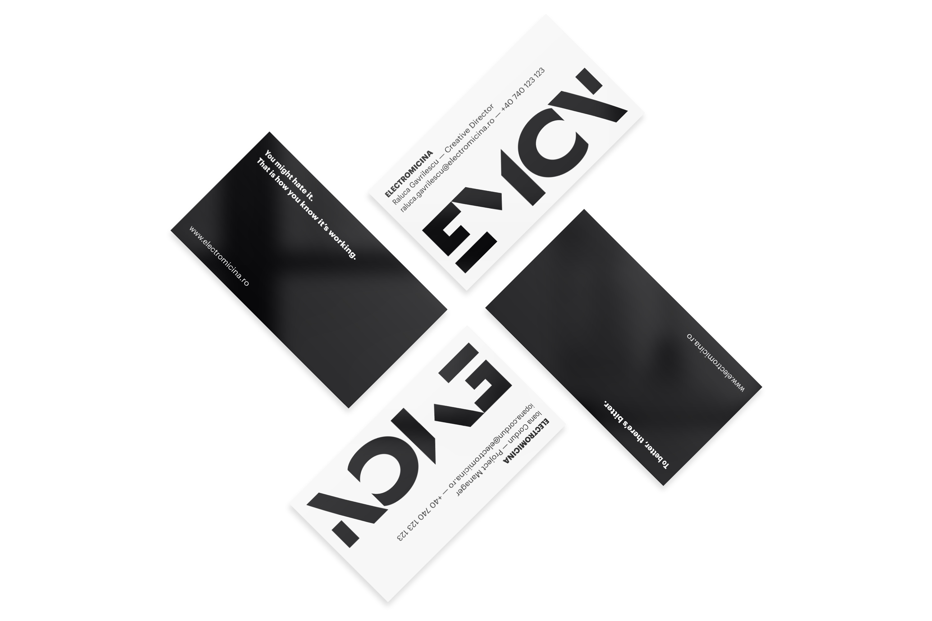
Identity for a communication agency, with a process that may seem daunting at first, but always delivers.
Identity for a communication agency, with a process that may seem daunting at first, but always delivers.
design & art direction:
Alexandru Darie
copywriting, naming & strategy:
Raluca Gavrilescu & Ioana Cordun.
electromicina.ro
The name was shortened for the logotype, which allowed increased visibility and playfulness, to contrast the monocromatic palette and the key messages. This minimalistic route allowed the agency to let their work shine, while still maintaining its character and voice.

Since a lot of their work is text-heavy, the applications focused on a simple grid and clear layout. The typeface used is Graphik.


