—
identity, HoReCa
2017
frankly burgers
identity, HoReCa
2017
—
Rebranding a gourmet burgers restaurant, that takes pride in its fresh ingredients, high quality locally-sourced beef and authentic recipes.
Rebranding a gourmet burgers restaurant, that takes pride in its fresh ingredients, high quality locally-sourced beef and authentic recipes.
design & art direction:
Alexandru Darie
copywriting & naming:
Raluca Gavrilescu & Ioana Cordun.
franklyburgers.ro
Frankly is a food-court burger restaurant. It needed to change the old look to reflect the new direction that it was taking. Aided by Mike Sergent, the new signature recipes improve the classic products by focusing on the star ingredient: the meat patty. All business strategy follows the same mantra—be frank (and cut the bulls**t). Everything has been stripped of unnecessary decorations, to move the focus on the customer experience.
—
frankly
/ˈfraŋkli/ adverb
in an open, honest, and direct manner.
in an open, honest, and direct manner.
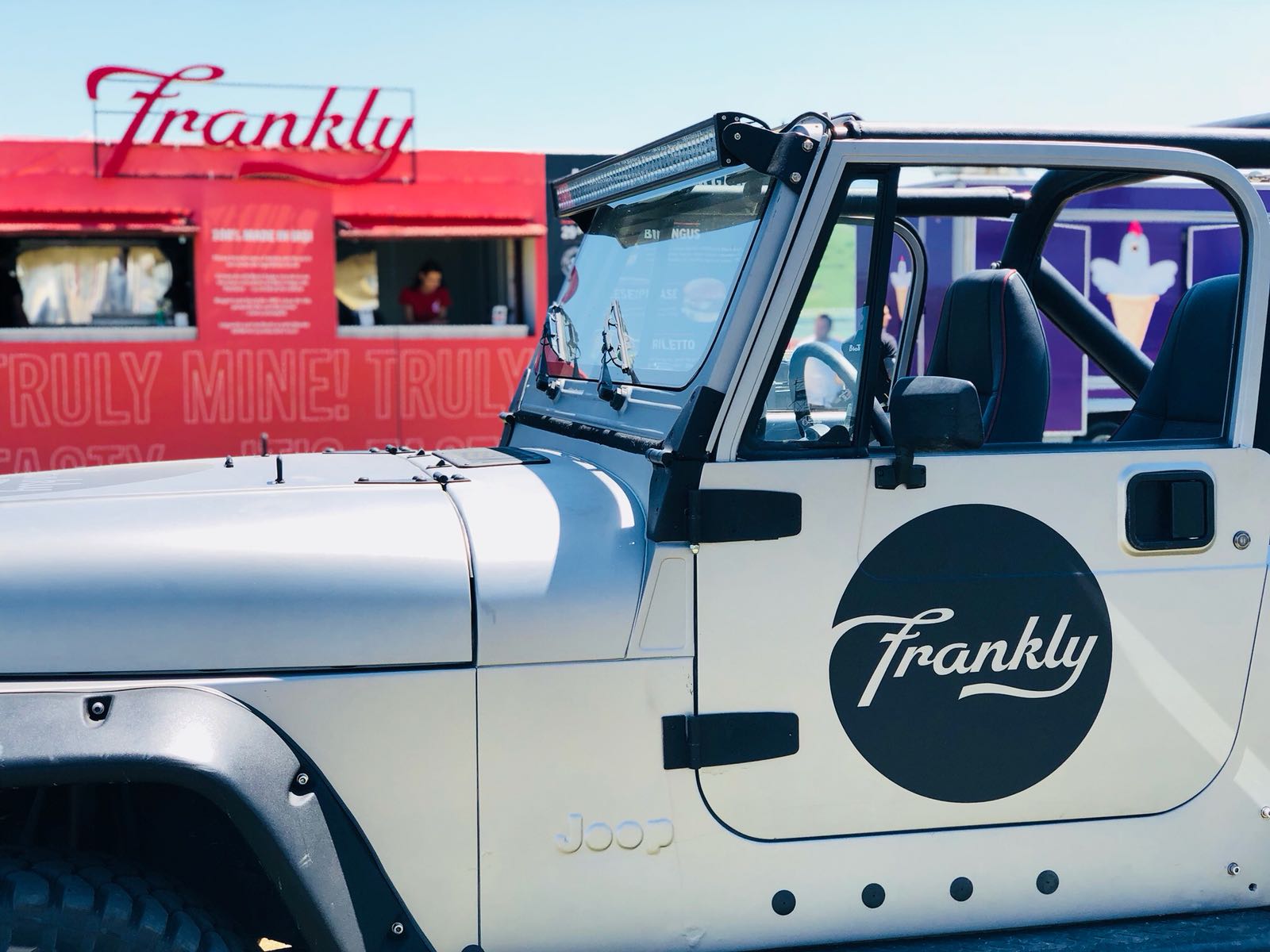
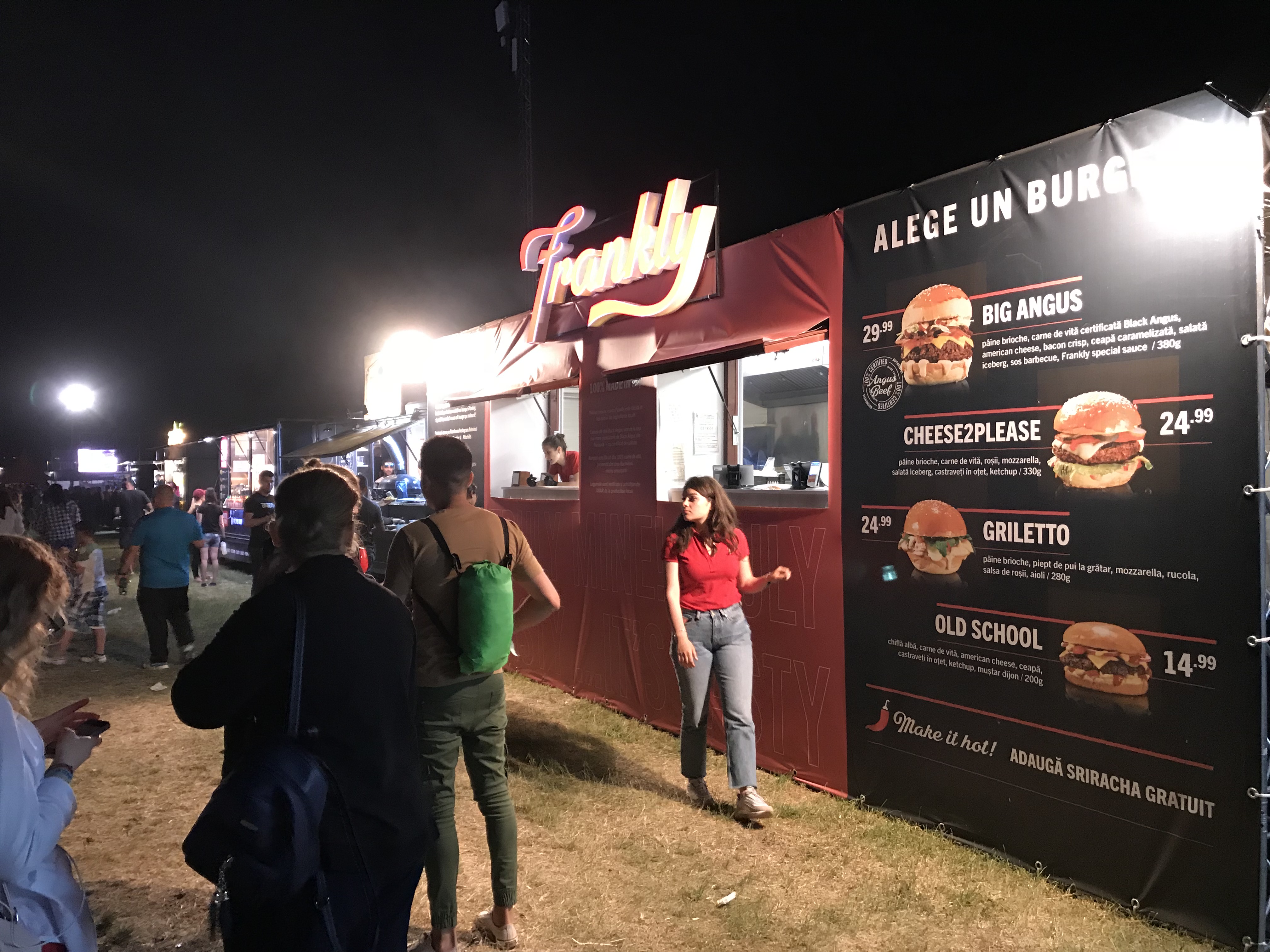
Because food courts are such chaotic places, the approach was to place the product in focus, while using big, clean color surfaces to attract attention and eliminate noise. The visual direction draws inspiration from the classic American Diner, at the beginning of the XX century. This serves both as a metaphor, and a differentiation factor from the hundreds of hipster-looking restaurants.
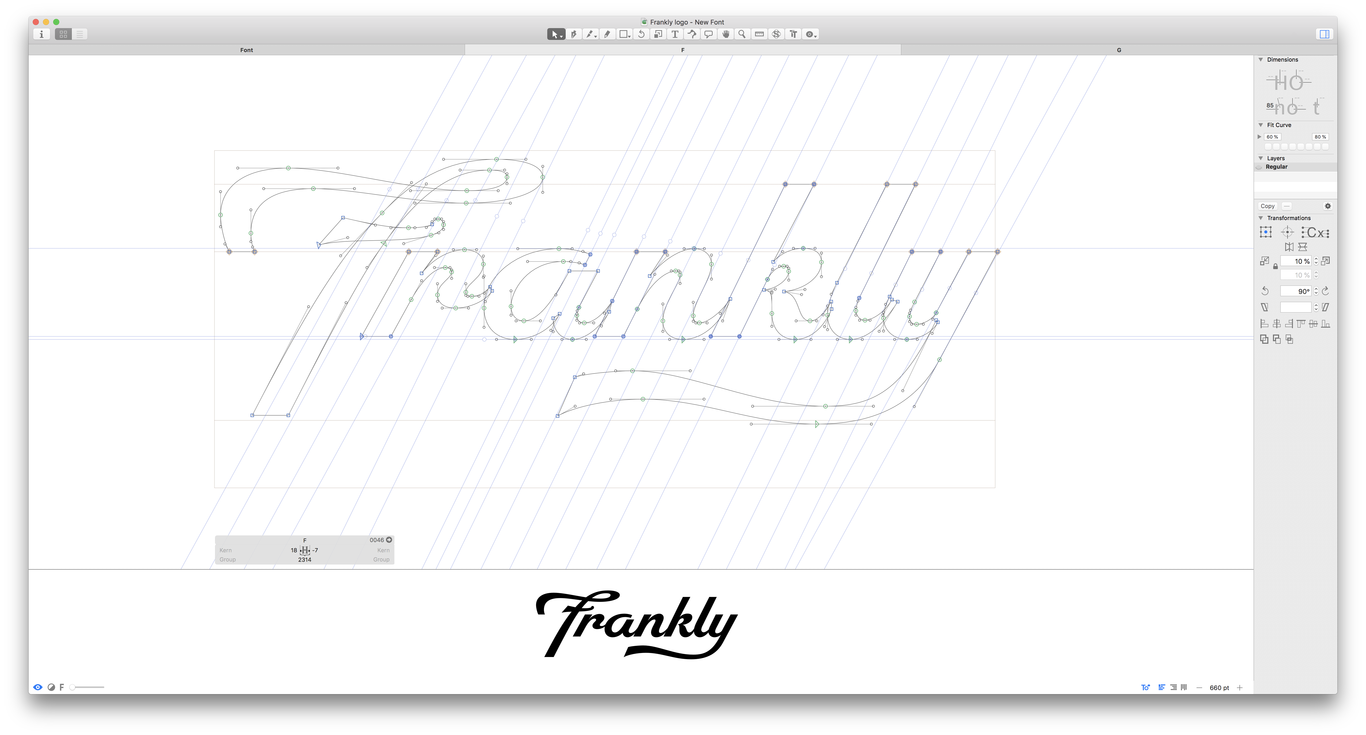
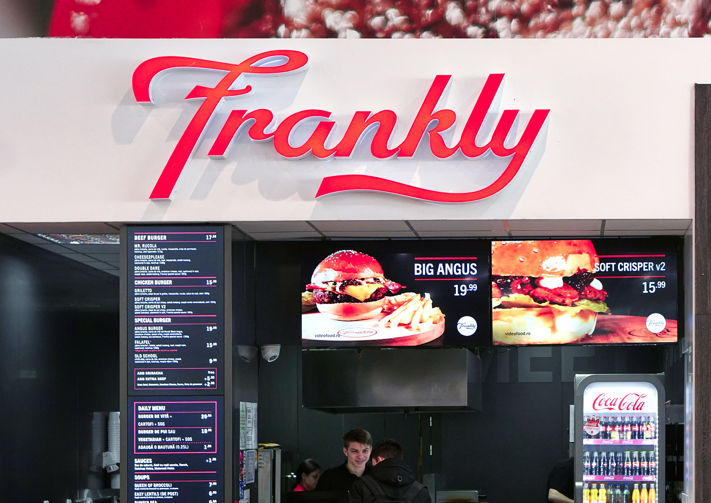
The new logo has a secondary variation, to be used on wide surfaces. The lettering is derived from Robu Bold, with adjustments made for large display purposes.
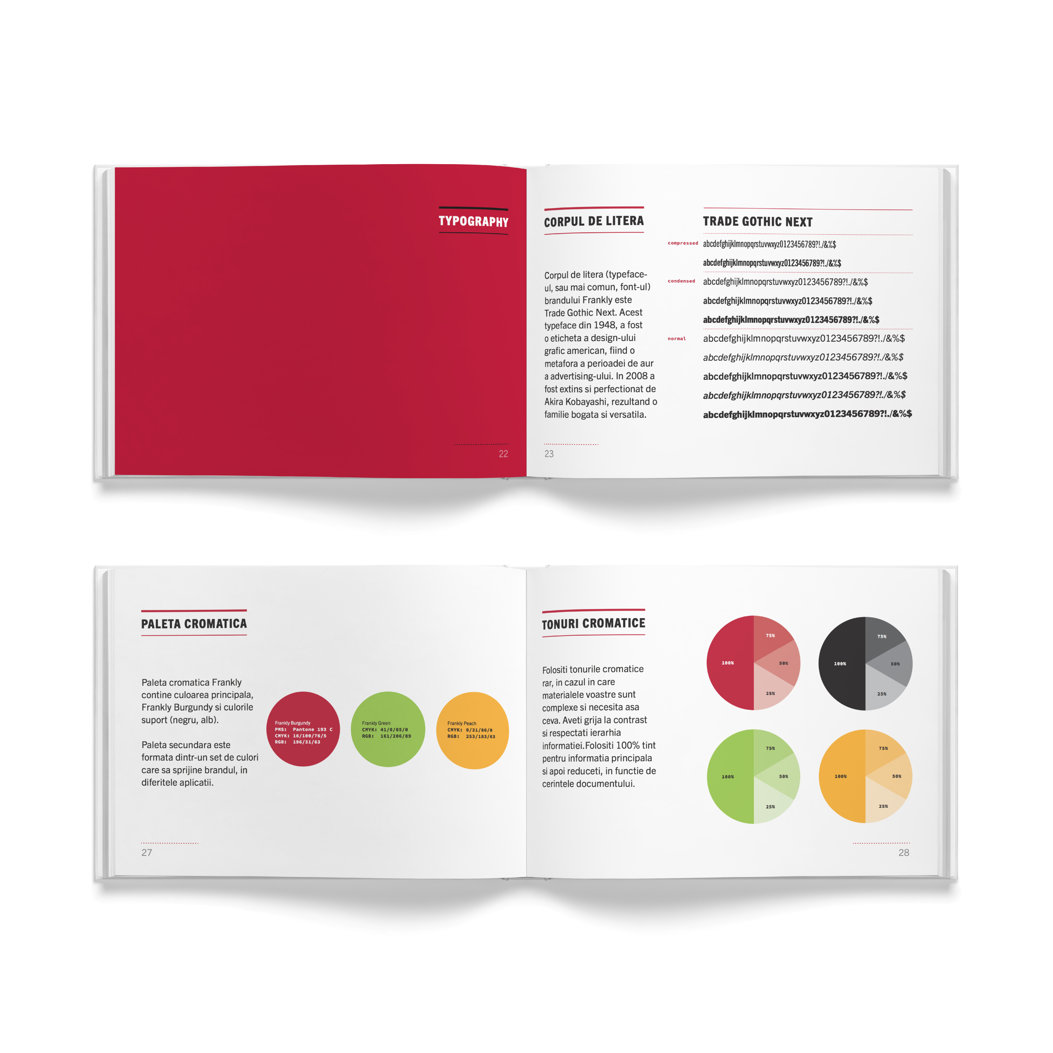
The Burgundy Red was the obvious chromatic choice, as a metaphor of the fresh beef meat. It catches the eye instantly and it has more than enough contrast to be seen from afar.
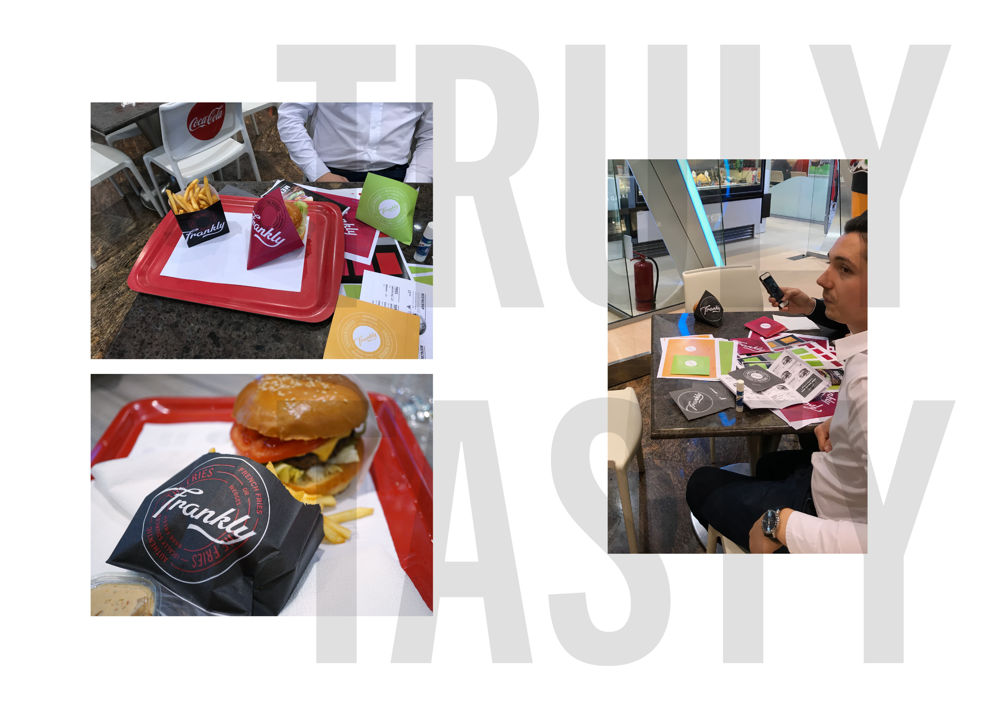
Testing different packaging variations, in the food court, to test visibility.


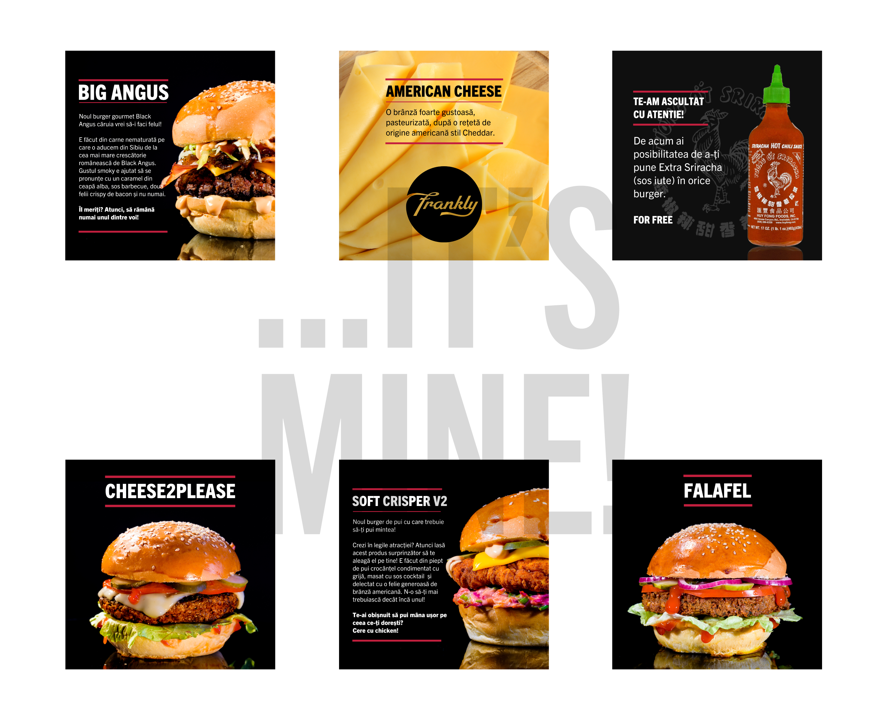
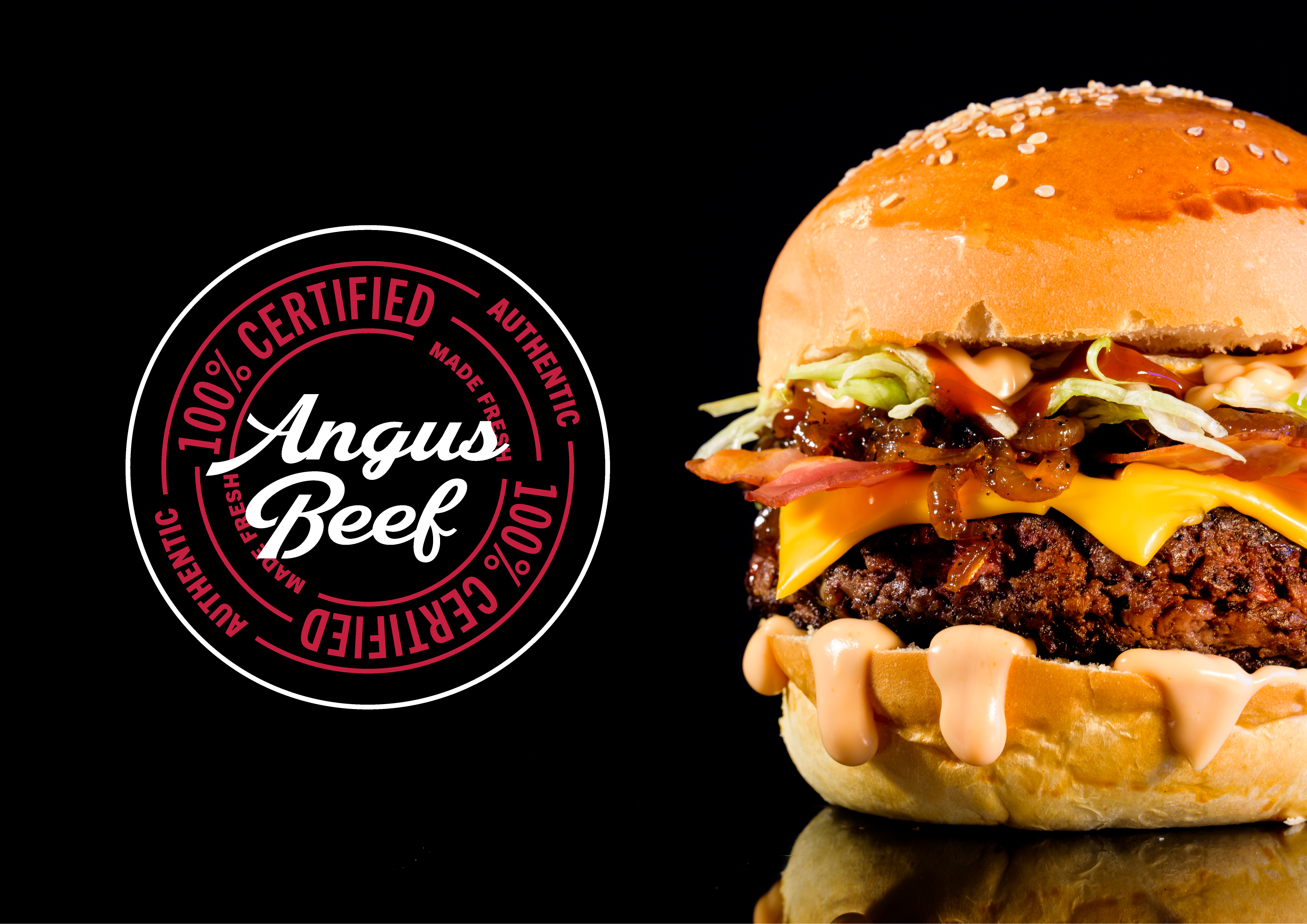
The new product shots and videos were comissioned to a local photographer. Using a black background allowed the products to truly shine and be desired.


