Arondent

A different kind of identity for a dental clinic.
Category
Services, Healthcare
Expertise
Brand Strategy, Narrative, Visual Identity, and Signage
Arondent’s visual identity challenges the conventional aesthetics of dental clinics, moving away from cold, clinical codes toward a more distinctive and approachable brand expression. The project covered visual identity, stationery, and signage, all designed to work as a coherently attractive system.

At the core of the identity lies an unexpected symbol. The crocodile bird is a true example of symbiosis in nature, living alongside the big reptile and feeding on remnants between its teeth. This metaphor translates directly to Arondent’s role: care, precision, trust. The bird functions as a strong symbol, allowing faster recognition and a memorable brand presence.
The logo is built through custom lettering, designed to feel both modern and human.


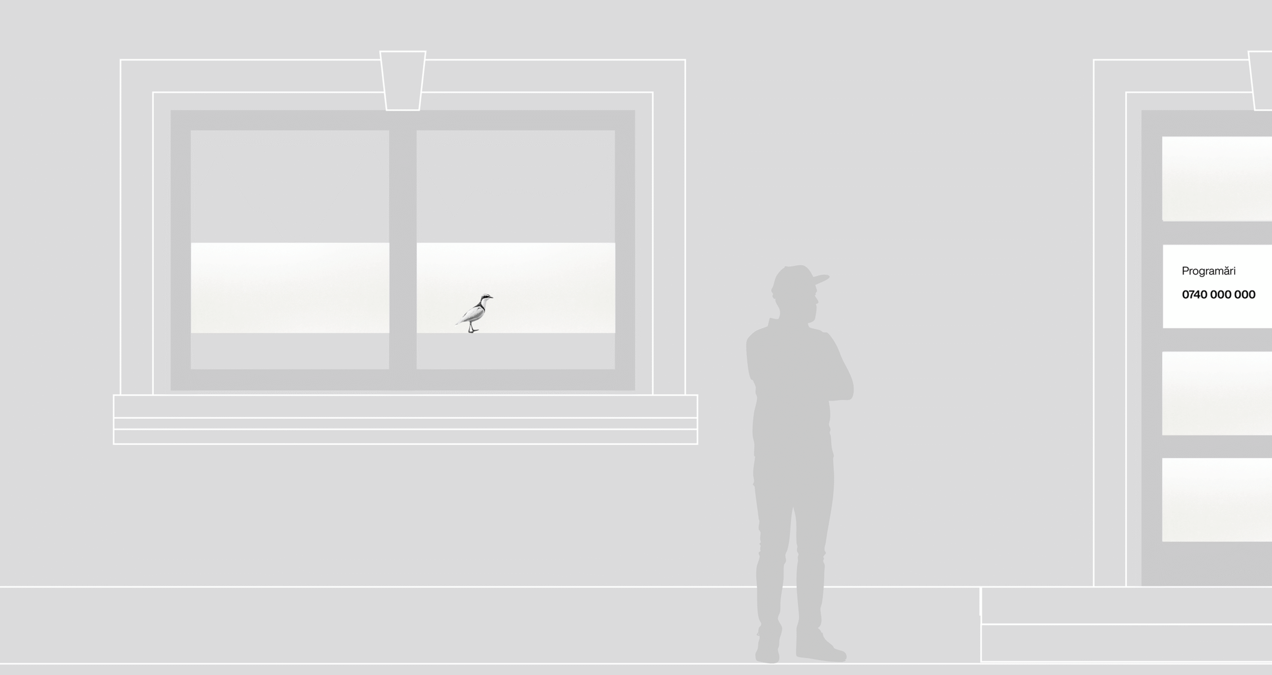
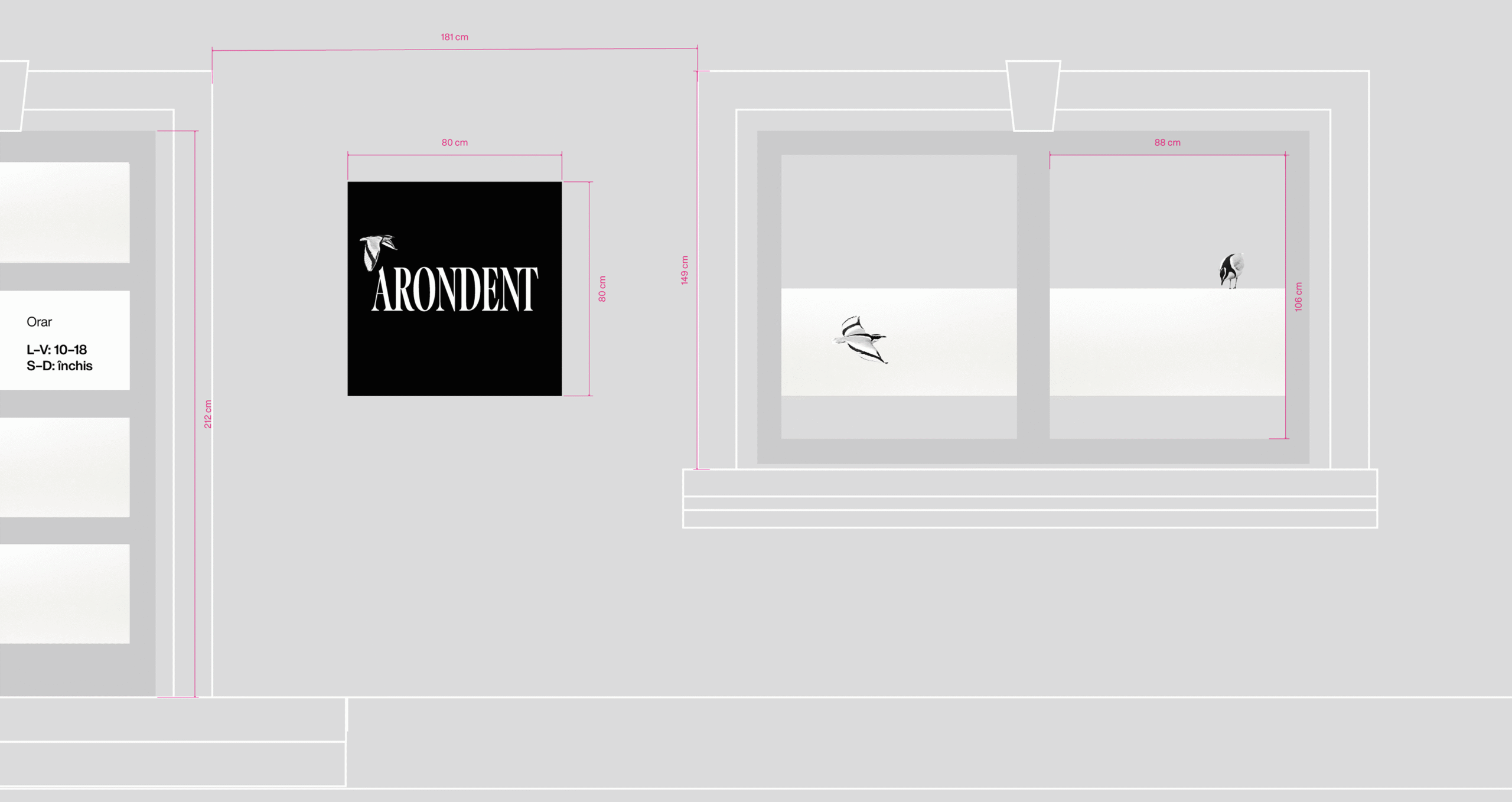
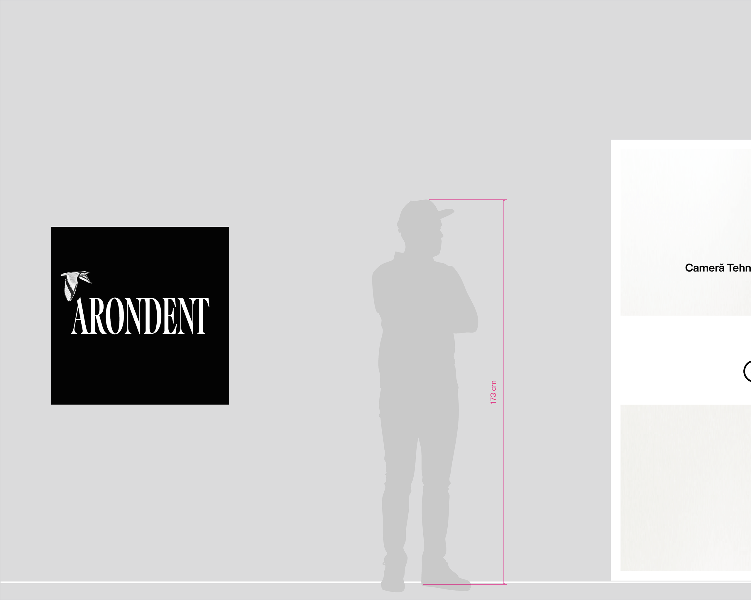

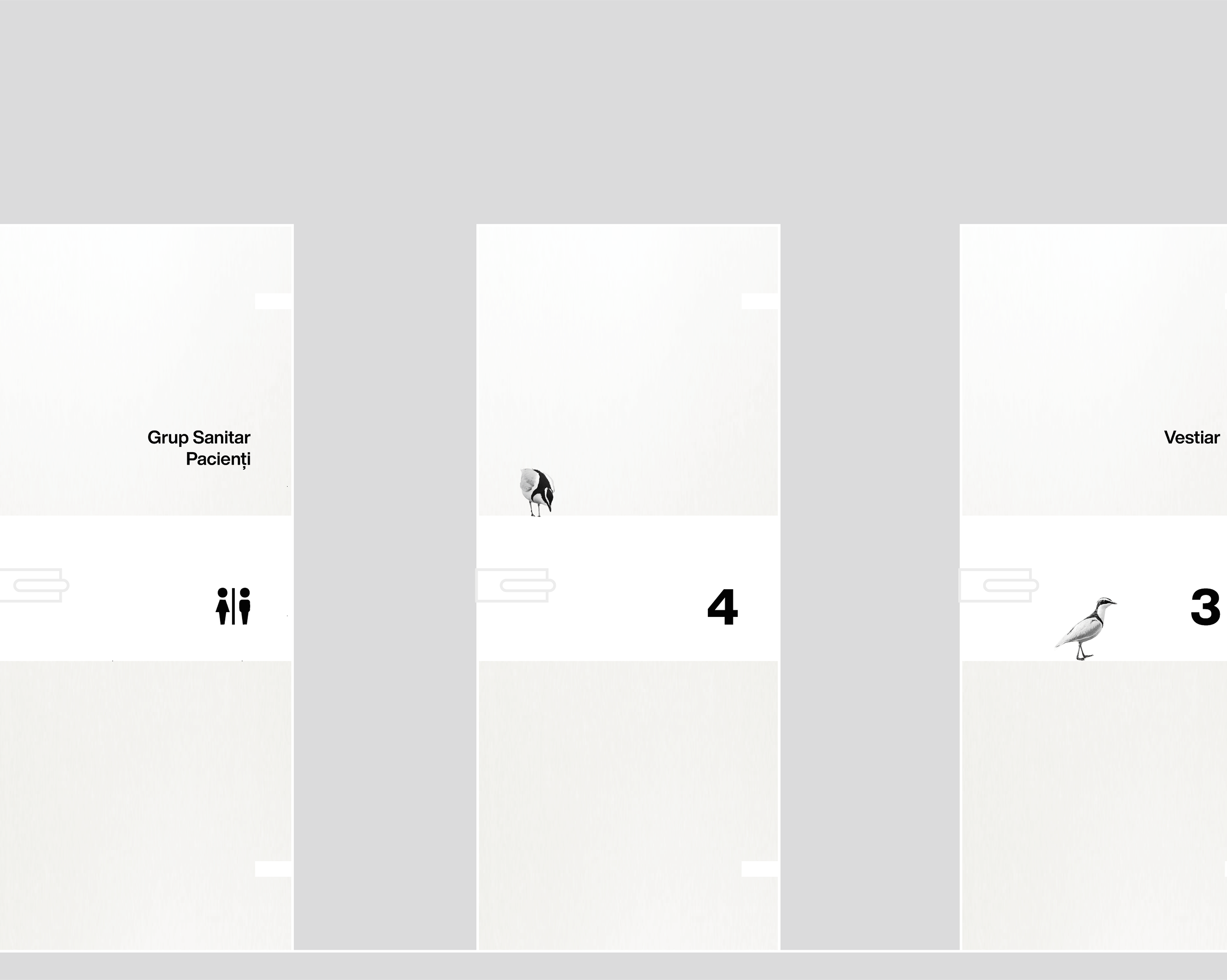
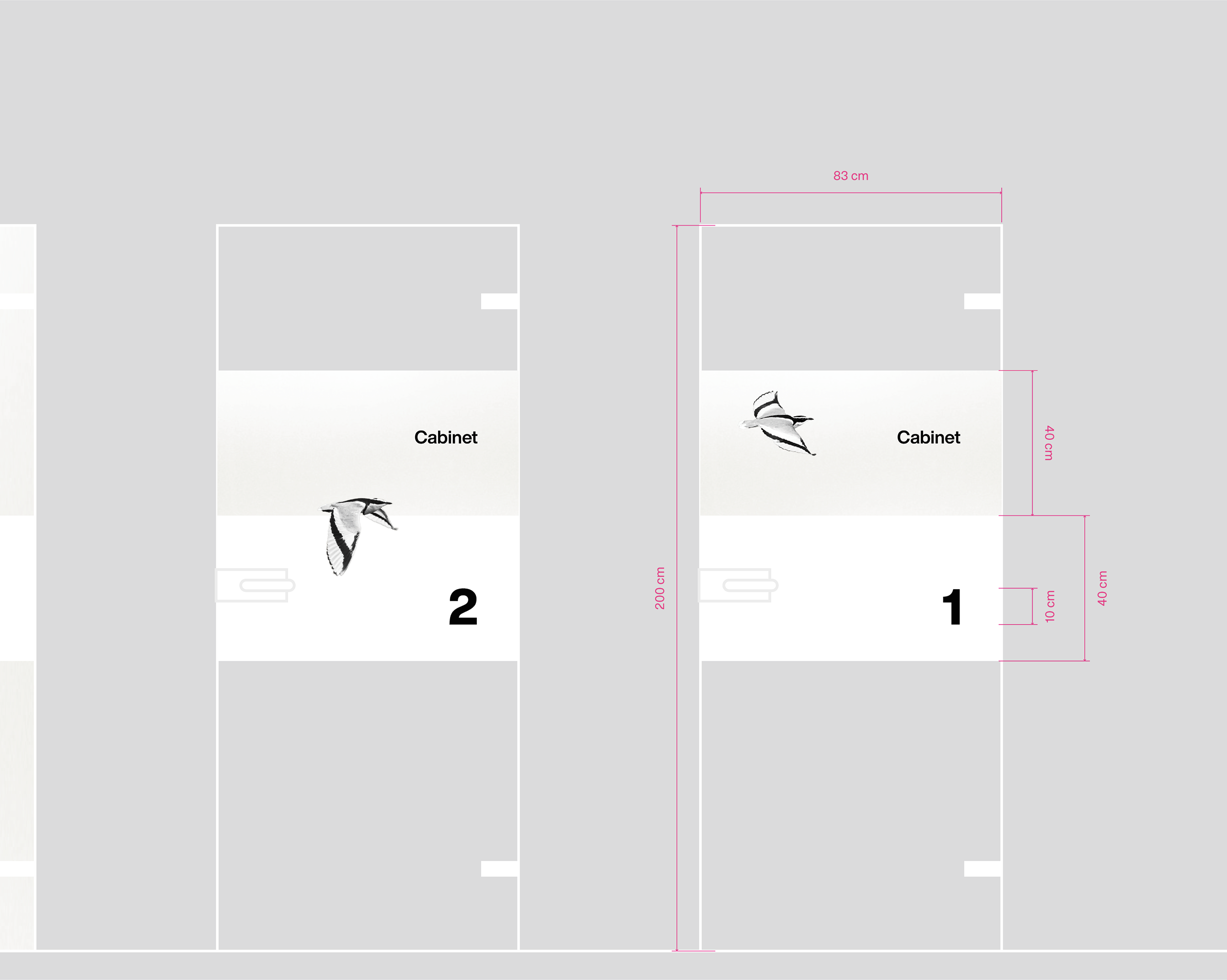
The minimalist visual language brings clarity and brightness to this identity, while the presence of the bird softens the clinical context. Hopefully even reducing patient anxiety, and definitely reframing the dental experience as calm and reassuring.


Selected Works

ThurosBranding & Identity
MarksBrand & Identity
FranklyBrand & Identity, Packaging
IndustrialType Design
NellspaBranding & Identity
Coco BoutiqueBrand Identity