—
identity, it
2017
crossover communities
identity, it
2017
—
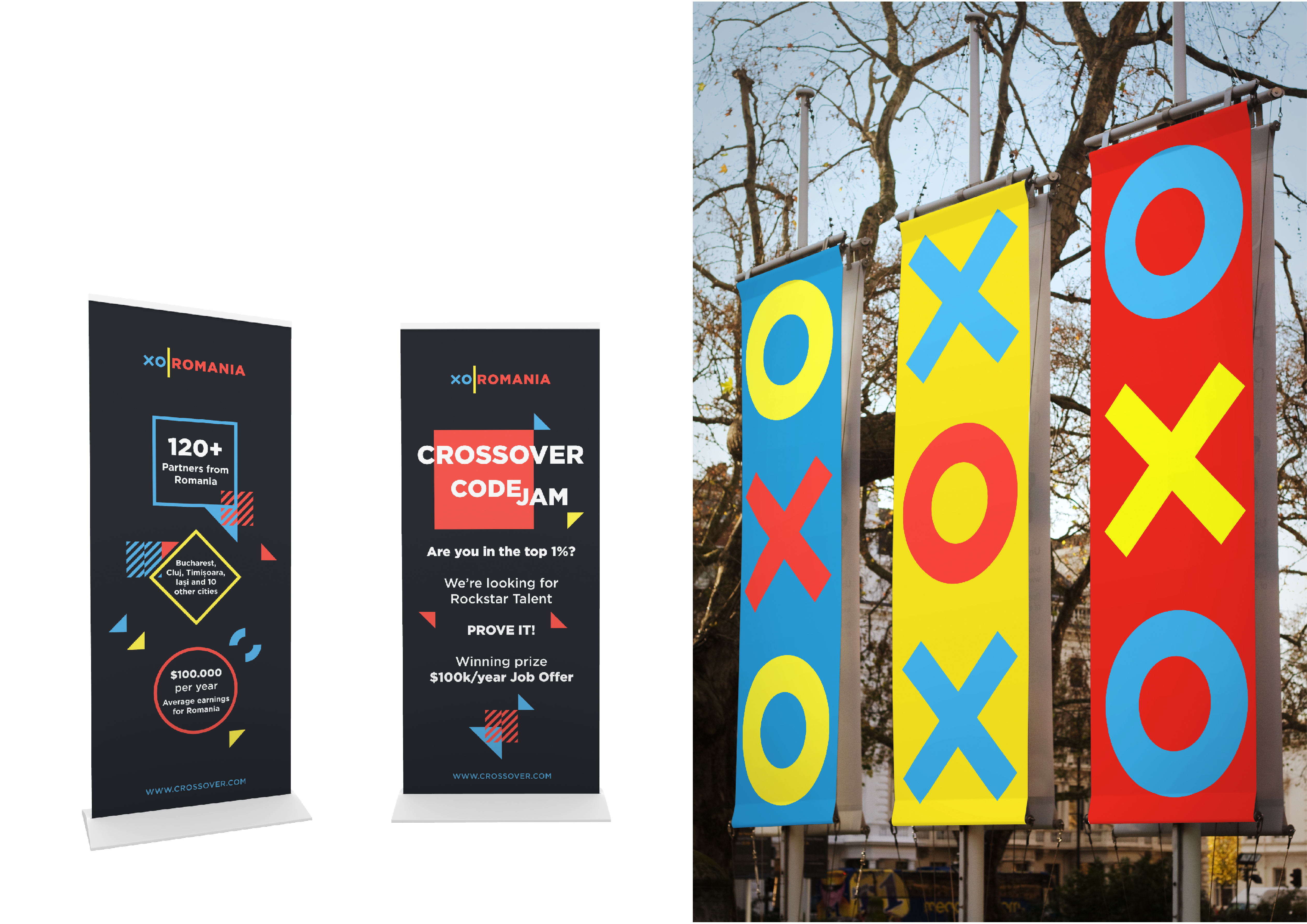
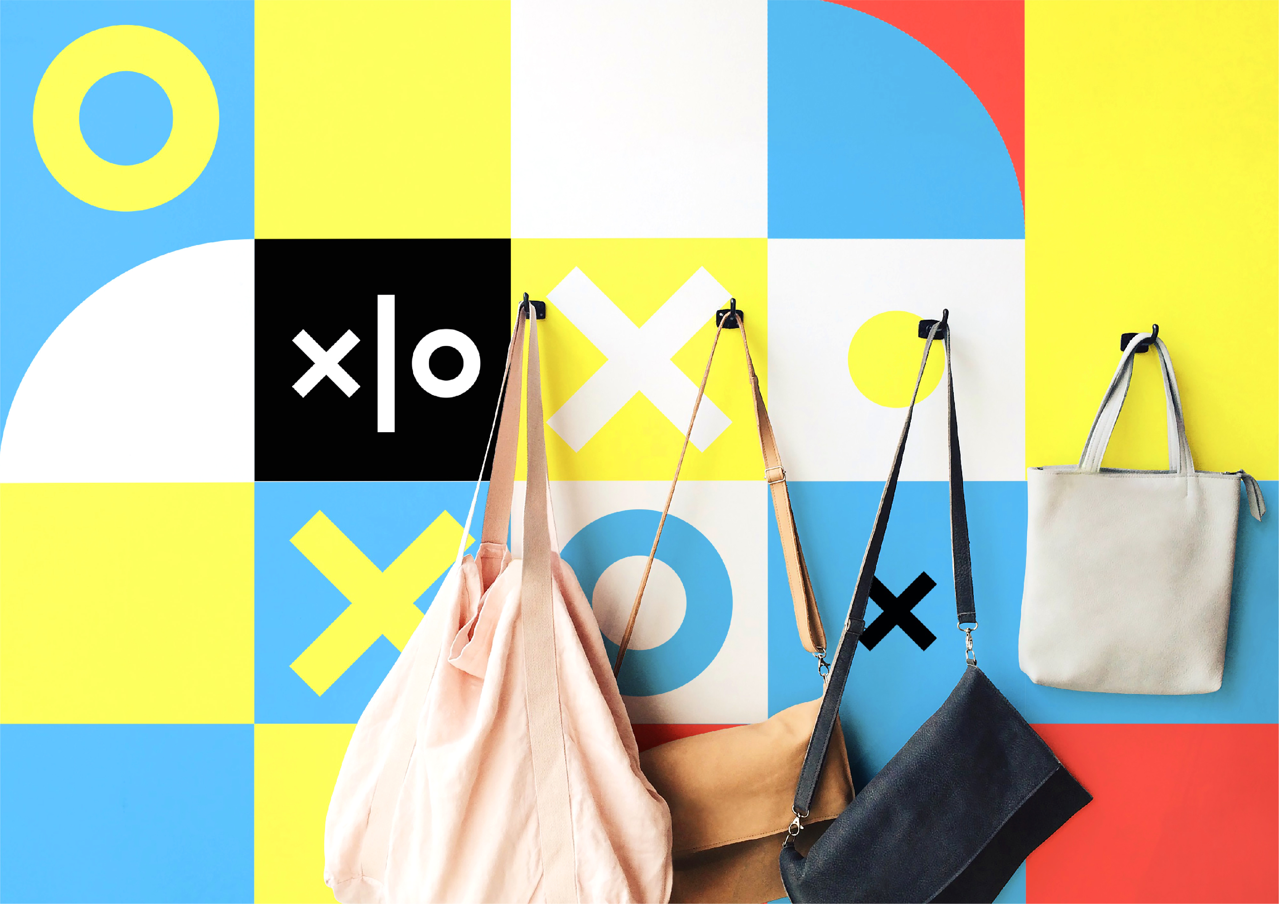
Identity system designed to allow people (from different communities, inside Crossover) to find the right voice to express themselves.
Identity system designed to allow people (from different communities, inside Crossover) to find the right voice to express themselves.

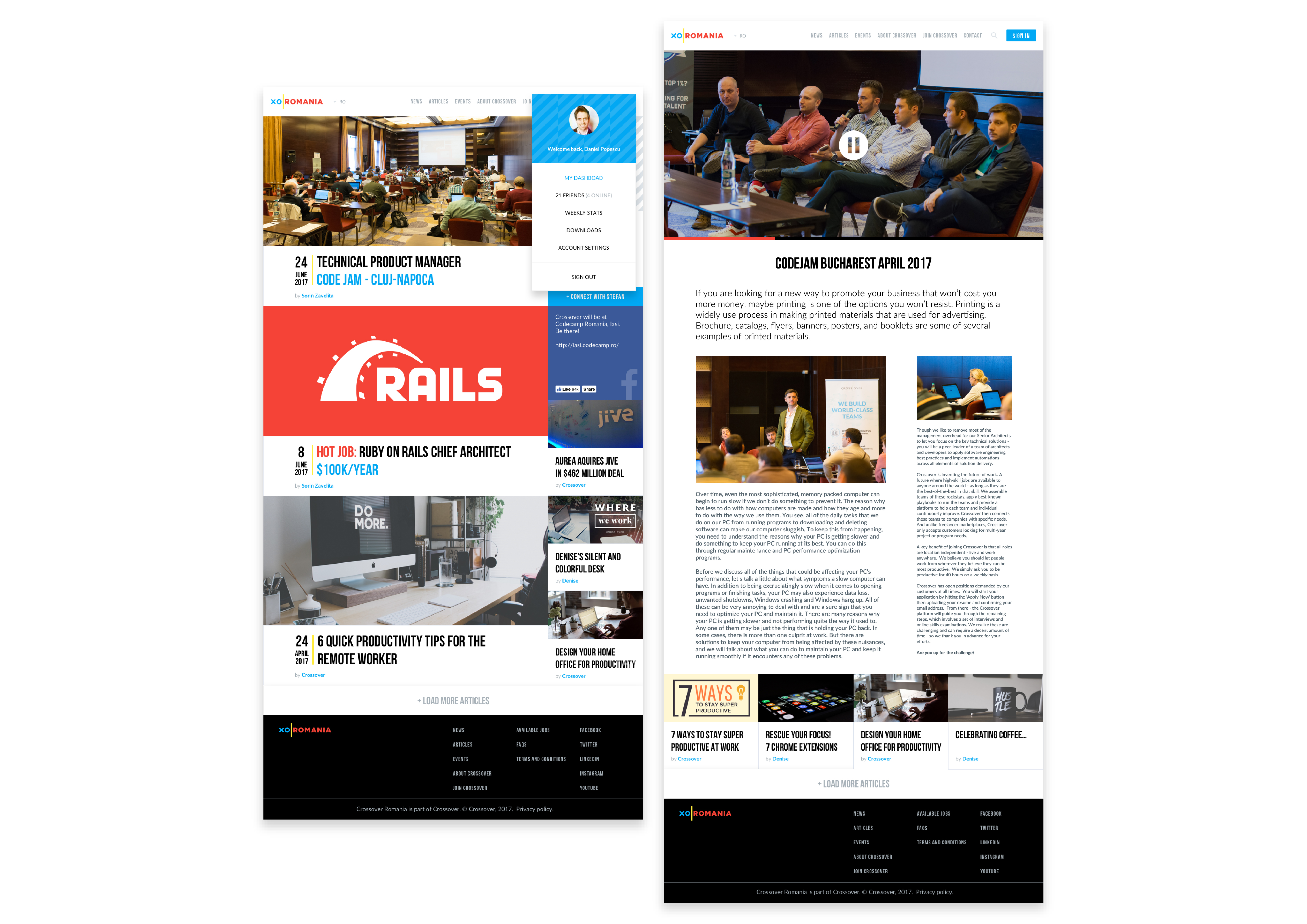
Crossover (also known as Crossover for Work) not only connects companies to the best IT talent from around the world, but also provides a seamless end-to-end solution for remote team management.
Developing a community
In order to address remote work rapport challenges, and to glue together teams, it was needed to build solutions for the partners
communities. They required a toolkit, to voice their ideas and beliefs, and
the current system was neither engaging, nor attractive. The visual system should allow everybody to tailor the brand image to their own personality, while maintaining a common
visual language.

Crossover partners often abbreviate the company name as XO.
Pairing the organization with a given city, or country name, should be easy and readable (which means shorter word-marks).
 The country colors have
been adapted from their
respective flags, to improve
contrast and to avert any
legal issues.
Wherever possible, the brand color Crossover Blue was used.
The country colors have
been adapted from their
respective flags, to improve
contrast and to avert any
legal issues.
Wherever possible, the brand color Crossover Blue was used.
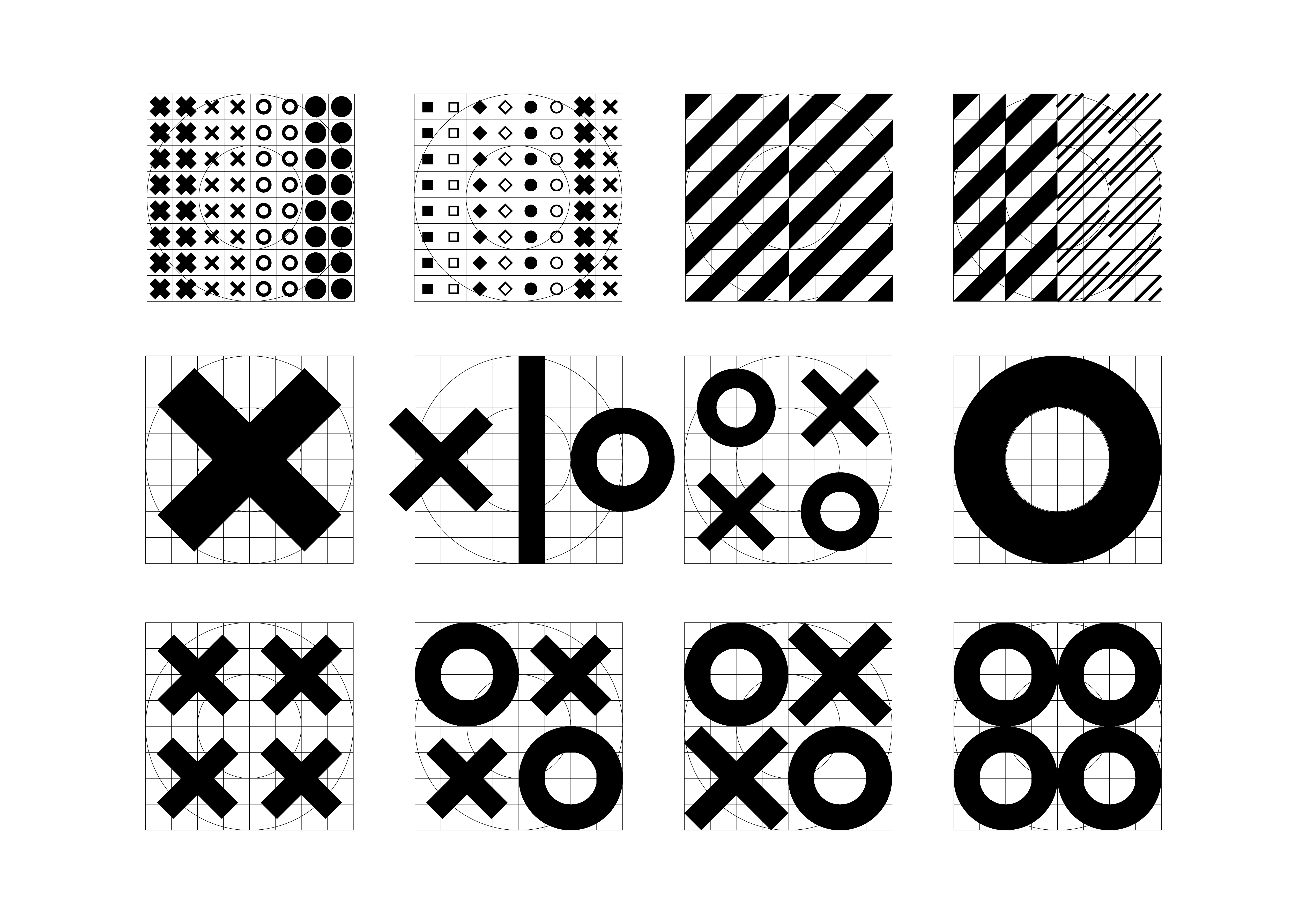

This system allows an infinite number of variations.

A design language was created, that promotes unity and flexibility, over uniformity and rigid guidelines; similar, yet distinct looks for our communities, ensure that everyone can express themselves as they see fit. It’s easy to adapt on a variety of formats, both print and digital.